It’s Monday, I’m Nithya Sudhir. I collect words, chase patterns, and write about whatever makes me curious.
How a yellow marker explains great branding
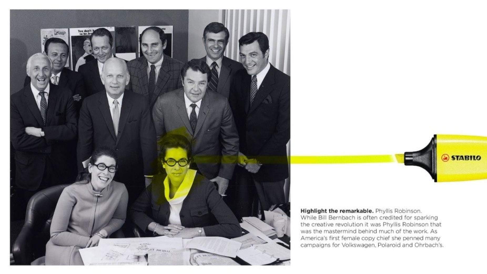
Everyone thinks highlighters are about color. They’re not.
They’re about restraint.
They make words pop out, against a background of obedient black ink on a quiet white page.
What does any of this have to do with brands?
It’s Monday. Let me show you.
Focus, without friction
Today we have the Bold, Italics, or Underline when we want to draw attention to something.
Or we have the classic CAPITAL LETTERS.
Sorry if that threw you off a little..
So originally, when people wanted to do that, emphasize text on paper, they underlined it or circled it.
But Underlines cut through descenders like g, y, and p.
Circles broke word shape recognition.
Heavy ink reduced contrast between text and page.
This matters because while writing may be flat, reading or thinking isn’t.
Your brain recognizes the silhouette of a word before it processes individual characters. Anything that distorts that outline slows comprehension.
Emphasis that makes reading harder defeats the purpose of emphasis.
Highlighters solved this by doing something counterintuitive. They made emphasis louder without making reading heavier.
A little pop of color!
Safety signage, road markings, industrial warnings. They were designed to be impossible to miss.
So one day, Francis J. Honn, then vice president of technology at Carter’s Ink, was experimenting with colors and chemicals.
He dragged a streak of fluorescent yellow across a page and expected to ruin it.
Instead, the words surfaced.
It actually helped call attention to - rather than camouflage - the words.
He named it the Hi-Liter.
According to The New York Times, by the 1970s, highlighters were preferred over pens to mark text.
Interesting Fact: Highlighters were deliberately designed to be imprecise.
They are wider than a line of text. They are slightly messy. And their edges are soft.
Why? Because precision demands effort. Effort slows attention.
The goal was never neatness. The goal was fast visual isolation.
Why your brain can’t ignore the odd one out
Why does this actually happen?
Psychology calls it the Von Restorff effect.
Named after the psychologist Hedwig von Restorff, it is also sometimes referred to as the ‘isolation’ effect.
In her experiments, she presented participants with a list of items, one noticeably different from the rest. She observed that people remembered the distinctive items more than others, leading her to propose the principle.
In plain words, it’s the tendency for our minds to remember what stands out.
For example in a list of words like: desk, chair, bed, table, chipmunk, dresser, stool, couch.
“Chipmunk" will be remembered the most as it stands out against the other words in its meaning (an animal, while the others are words for furniture).
Seeing something unique or different from the rest of our surroundings triggers our attention and stands out in our memory. This heightened attention to the distinct item leads to better retention of that information.
The cookware that refused to blend in
In a world of black, silver, and steel cookware, Caraway shows up in soft pastels and clean geometry. Sage, cream, muted blue. Cookware that looks less like equipment and more like a design decision.
One customer review says it best.
“Sexy and cookware aren’t terms we’re apt to pair, but Caraway just seamlessly melded the two together.”
That reaction is not accidental.
Here is how the isolation effect works in their favor.
They operate in a visually monotonous category where sameness is the norm.
They built massive social media and word of mouth momentum by being instantly recognizable in a feed.
They command premium pricing without competing on performance specs alone.
They turned cookware into an identity object rather than a utility purchase.
Caraway is a highlighter in a kitchen drawer full of black pens.
It does not redesign the kitchen. It simply refuses to disappear into it.
How brands can highlight without screaming
Brands looking to do the same do not need louder messaging. They need cleaner contrast.
Create contrast, not noise.
Attention comes from difference, not volume. The quieter the environment, the louder contrast feels.
Change one thing, not everything.
Pick a single dimension to stand apart on and keep the rest familiar so the difference feels intentional, not chaotic.
Make it visible before it’s understandable.
If people need an explanation to notice it, the design has already failed.
Remove effort from noticing.
Anything that requires decoding slows attention and weakens impact.
Protect clarity while increasing prominence.
Standing out should never make the message harder to read or grasp.
Design for instant recognition, not persuasion.
The best emphasis works before thinking even starts.
The highlighter pen never begged for attention. It just showed up differently and trusted your brain to do the rest.
So what is your highlighter stroke? Where are you choosing quiet contrast over loud persuasion?
How's the depth of today's edition?
As always, hit reply if something in here hits home.
See you next week,
Nithya
P.S. If you want to get a case study about your own brand, reply to this email. If you’d like to reach our newsletter audience (founders, creators, and marketers), click the button below.
If you’re new here, I’m over the moon you’ve joined us! To help me craft content that’s actually useful (and not just noise in your inbox), I’d love it if you took 1 minute to answer this quick survey below. Your insights help shape everything I write.
Insane Media is more than one voice
💡 Dive into our other newsletters - where psychology meets the founders, creator economy, Human resources and AI trends.


